Bar Chart (Dynamic) Masterclass
Learn to describe trends over time with precision — tracing rises, falls, plateaus and turning points like a Band 7+ writer.
What Is a Dynamic Bar Chart Question?
A Dynamic Bar Chart plots data across multiple time periods, showing how figures change over time. Unlike static charts, your focus here is on the journey — not just individual values. You need to identify the overall direction of change, any crossover or convergence points between categories, and any exceptions or reversals at the end of the period.
Study the prompt carefully before writing. Identify the key variables, time periods, and units.
Plan First — Always
⏱ Use the First 2–3 Minutes to Plan
Before typing a single word of your essay, spend 2–3 minutes identifying: the main trend(s), any notable exceptions or comparisons, and how you will group your detail paragraphs. Students who plan first consistently write more cohesive, Band 7+ responses. Jumping straight into writing is one of the most common mistakes test-takers make.
📋 The 4 Official Marking Criteria — Equal Weighting
Every Task 1 answer is marked on exactly four criteria, each worth 25% of your Task 1 score:
1. Task Achievement — Did you address the task? Is there a clear overview? Did you select and highlight key features?
2. Coherence and Cohesion — Is the essay logically organised? Does it progress clearly? Are cohesive devices used appropriately, without over-use?
3. Lexical Resource — Is vocabulary varied and precise? Are less common words used appropriately?
4. Grammatical Range and Accuracy — Are a variety of structures used? Are sentences mostly error-free?
The overview directly impacts Criterion 1. Vocabulary variety directly impacts Criterion 3. Sentence variety impacts Criterion 4. All four are equally important.
The 4-Paragraph Formula
Why Always 4 Paragraphs?
A clear 4-paragraph structure instantly signals to the examiner that you are organised and aware of what Task 1 requires. It separates general from specific, ensures you never mix raw data into your overview, and makes your essay easy to read and mark. Stick to this every single time.
1 Paragraph 1 — Introduction INTRO
Paraphrase the task prompt. Replace "the chart" → "the bar chart", "shows" → "illustrates", "percentage of households" → "proportion of households", "owned and rented accommodation" → "owner-occupied and rented housing". Restructure if possible.
Paraphrase: The bar chart illustrates the proportion of households that owned and rented accommodation in England and Wales over the period from 1918 to 2011.
2 Paragraph 2 — Overview OVERVIEW ★
The Overview — Identify the Main Shift
Start with Overall,. State the dominant trend (renting fell, ownership rose), note that they swapped dominance, and mention any exception at the very end. No specific years or percentages here.
3 Paragraph 3 — Detail Group 1 DETAILS
Describe the ownership trend from start to finish, noting significant milestones. Include the 1971 crossover point (50% each) and the peak in 2001. Use a variety of change verbs and adverbs.
4 Paragraph 4 — Detail Group 2 DETAILS
Describe the renting trend from start to finish. Begin with its dominant position in 1918, follow its steady decline, reference the 1971 crossover, and end with the slight reversal in 2011. Use contrast language like "By contrast" to open this paragraph.
How to Build Your Sentences
Mix All Three Types Naturally
IELTS examiners reward grammatical range. The key word is natural. Only use linking words and complex structures when they genuinely improve clarity, never just to sound academic.
Simple Sentence
Use these for stating a clear starting or ending point, or for a single significant data point.
Compound Sentence
Connect two related time points or two categories at the same time point with conjunctions like while, whereas, but, and.
Complex Sentence with Time Clause
Use time-based subordinate clauses to show sequences of change. This is essential for dynamic (time-based) charts.
Language of Change — Your Essential Toolkit
For dynamic charts, you need a rich vocabulary of movement verbs and adverbs. Here are the key ones:
📉 Fall: fell, declined, decreased, dropped, dipped, plummeted
➡ Stay stable: remained stable, plateaued, levelled off, held steady
⚡ Speed: sharply, dramatically, significantly / gradually, steadily, slightly, marginally
📐 Approximation Language — Essential for All Charts
Unless you can read an exact figure from the chart with certainty, always approximate. This is not imprecision. It is accuracy. Using approximation language correctly demonstrates maturity in academic English and is rewarded under Lexical Resource.
Slightly under a value → just under, just below, slightly below
Close to a round number → approximately, around, at about, roughly, nearly, close to
✅ "Ownership reached just under 70% in 2001."
✅ "Renting stood at approximately 78% at the start of the period."
✅ "Production amounted to at about 530 billion kWh."
❌ "Ownership reached 69.8% in 2001." [Never invent false precision]
Strategies Specific to This Question Type
📅 Dynamic = Change Over Time
A dynamic bar chart plots data across time periods. Your job is to describe the journey of each category, not just isolated data points. Was the change consistent? Was there a turning point? Did the categories cross or converge?
Key Questions to Ask Before Writing:
• Did ownership and renting ever become equal? (Yes, in 1971 both reached 50%)
• Which category started higher? Which ended higher?
• Was there any reversal of trend at the end? (Yes, renting rose slightly in 2011)
🔁 Contrast the Two Categories
When a chart shows two contrasting trends (one going up, one going down), you must highlight the contrast. This is where the "inverse relationship" observation earns you marks.
📌 Note Exceptions to the General Trend
If the overall trend is upward but there is a brief dip or plateau, mention it briefly. If the trend reverses at the end, flag it as a notable exception. Examiners want to see that you can identify both the macro trend and any micro deviations.
Pro Tips That Separate Band 7 from Band 6
Proofread After Each Sentence
Don't wait until the end to proofread. Read each sentence immediately after writing it. If you spot errors at the end with only 30 seconds left, you will panic and that leads to more mistakes. Sentence-by-sentence proofreading keeps you calm and accurate.
Keep Your Overview Data-Free
The overview covers main trends, differences or stages. Never include specific numbers, percentages, or dates here. Save all raw data for your detail paragraphs. This is the single most common mistake that costs students marks on Task Achievement.
Group Details Logically
Don't just describe each category one by one. Group the highest with the lowest to show contrast, OR the highest with the second-highest if they're close together. Logical grouping shows analytical thinking, which is exactly what examiners reward.
Paraphrase — Don't Copy
Your introduction must paraphrase the task prompt using strong synonyms where appropriate. But don't force synonyms — only replace words when a genuinely better alternative exists. Forced vocabulary sounds unnatural and lowers your Lexical Resource score.
Do Not Over-Use Linking Words
The official IELTS criteria explicitly penalises both under-use and over-use of cohesive devices. Do not start every sentence with "Furthermore", "Moreover" or "In addition". Use linking words only when they add logical meaning. Two or three well-placed connectors per paragraph is enough. Forcing them into every sentence reads as mechanical, not fluent.
Aim for 175–200 Words
The official minimum is 150 words. Going under directly reduces your Task Achievement score. The sweet spot is 170–190 words. Going much over 200 wastes your 20 minutes and risks introducing errors. Every sentence must add genuine information value. Padding to reach a word count is penalised under Task Achievement.
Use Approximation Language — Always
Saying "approximately 60 billion" or "at about 50%" is not a weakness — it is a sign of academic writing maturity. Use: just above, just under, approximately, around, at about, roughly, nearly, close to. Reserve exact figures only for the clearest data points. Approximating correctly is actively rewarded by IELTS examiners under Lexical Resource.
Show the Relationship Between Categories
If one line goes up as the other goes down, explicitly state this inverse relationship. If they converge, mention when and where. This analytical observation is exactly what separates a Band 6 from a Band 7 response.
Full Model Answer — Annotated
Model Answer with Paragraph Labels
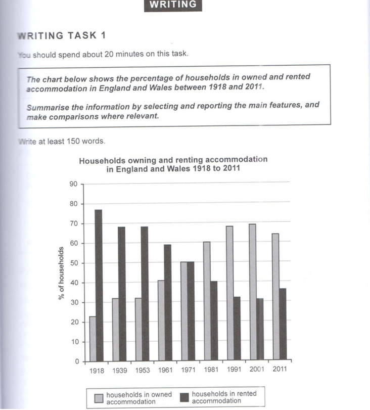
The bar chart illustrates the proportion of households that owned and rented accommodation in England and Wales over the period from 1918 to 2011.
Overall, there was a marked shift from renting to home ownership. Renting was initially the dominant housing tenure, but ownership increased steadily over time and eventually became the more common form of accommodation. Although ownership reached a peak towards the end of the period, it declined slightly in the final year, while renting followed the opposite pattern.
In 1918, only 22% of households owned their homes. This figure increased gradually to 31% in both 1939 and 1953, before rising more noticeably to 42% in 1961. In 1971, ownership reached 50%, matching the proportion of rented accommodation for the first time. After that, growth continued, with ownership climbing to 60% in 1981 and then to 68% in 1991. It peaked at 70% in 2001, before slipping slightly to 65% in 2011.
By contrast, renting stood at 78% in 1918, making it the dominant housing tenure at the beginning of the period. The proportion declined steadily to 69% in 1939 and 68% in 1953, followed by a further drop to 58% in 1961. In 1971, renting fell to 50%, equaling ownership. The downward trend continued to 40% in 1981 and then to 32% in 1991, reaching its lowest point of 31% in 2001. However, in 2011, renting rose modestly to 35%, marking a slight reversal of the long-term decline.
✅ What Makes This a Band 7+ Response?
Notice how the introduction paraphrases without copying. The overview clearly states main trends or differences without any raw data, which is the key Band 7 Task Achievement requirement. The detail paragraphs group information logically with clear progression throughout, satisfying the Coherence and Cohesion criterion. The language moves naturally between simple, compound and complex sentences without over-using linking words, and vocabulary is varied without being forced.
Want Your Dynamic Bar Chart Answer Marked by an Expert?
Get personalised feedback on your Task 1 essays from Ed — an IELTS expert who has helped hundreds of students reach Band 7 and above. Your band score is not fixed. Let's raise it together.
Start Your Journey at IELTSbyEd.com →Join hundreds of students who improved their band score with IELTSbyEd
